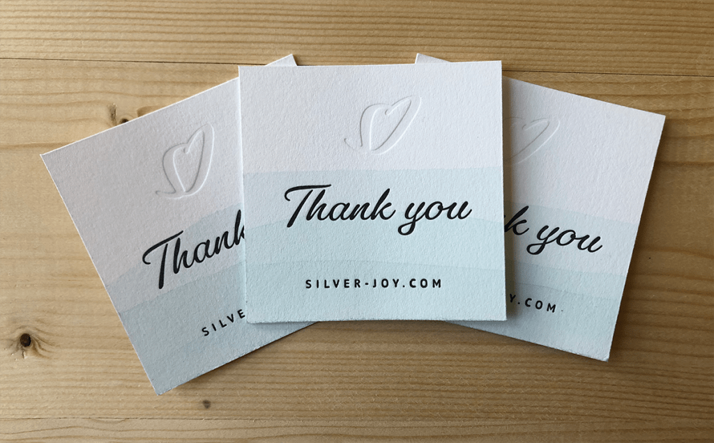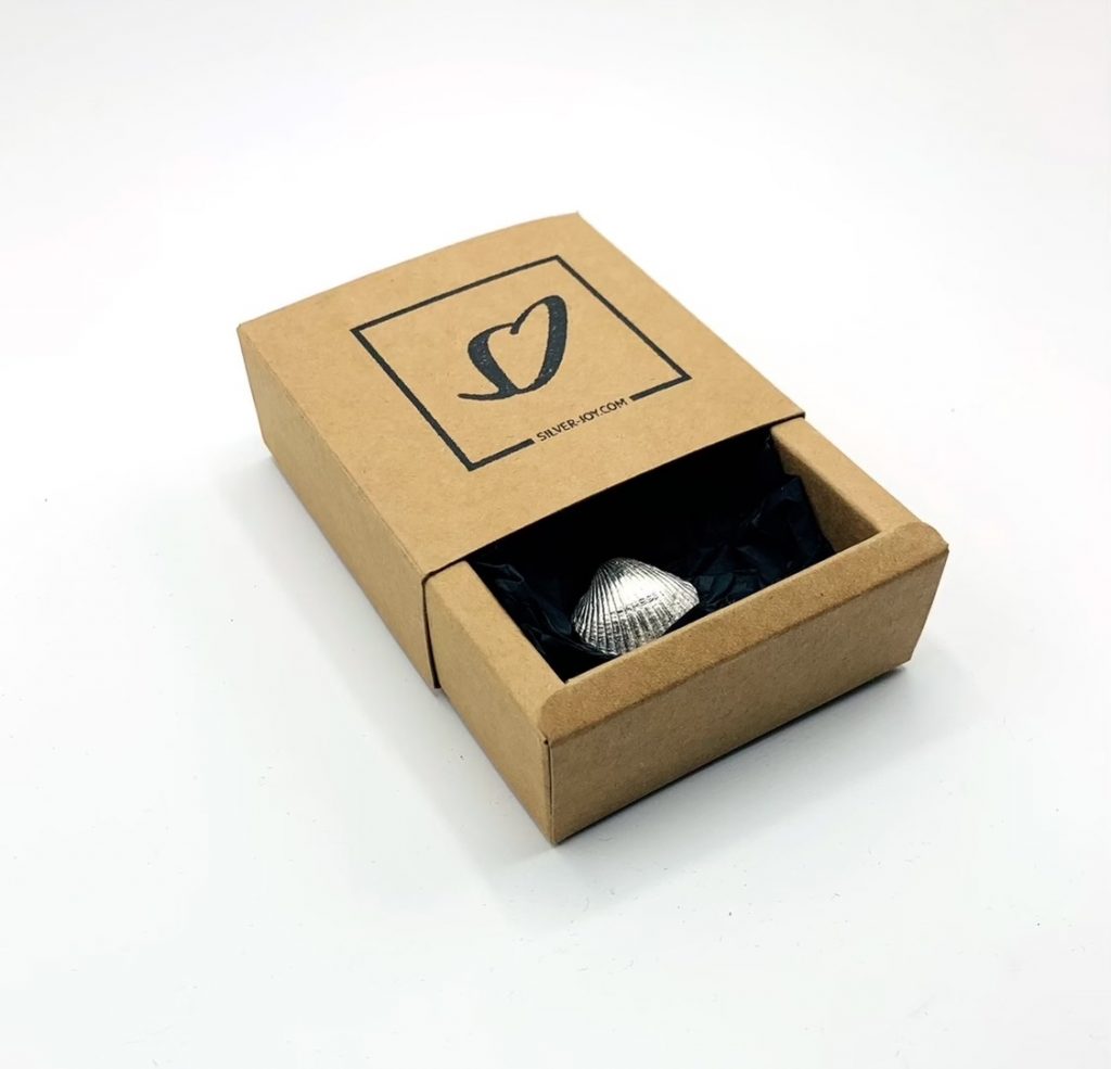


Recycled silver jewellery, a gift from nature. Drawing from the natural forms of the jewellery design, I created a logo that seemingly flows together. There is a simple two colour pallet with hues reminiscent of the ocean and the silver used. Elegant and contemporary, with letterpresses thank you notes and stamped recycled card boxes.
The thick stock and embossed logo gives a tactile nature that reflects the tactile nature of the jewellery, whist the dip stained paper carries across the brands colours in a subtle but effective way.
