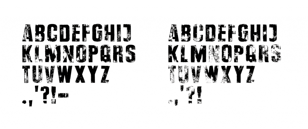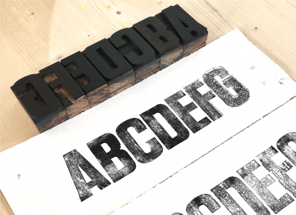
This font was created from wooden letterpress type to resolve the problem of having to use textures to mimic the look of printed type. There were several problems with this method the most prominent being losing the nicks and scratches that would be present every time a single letter was printed. But it was also important that when two letters sat next to each other they weren’t identical, for this reason I printed two of each letter.
Both versions of the alphabet where then turned into vectors, with alternate letters included in the fonts glyphs.
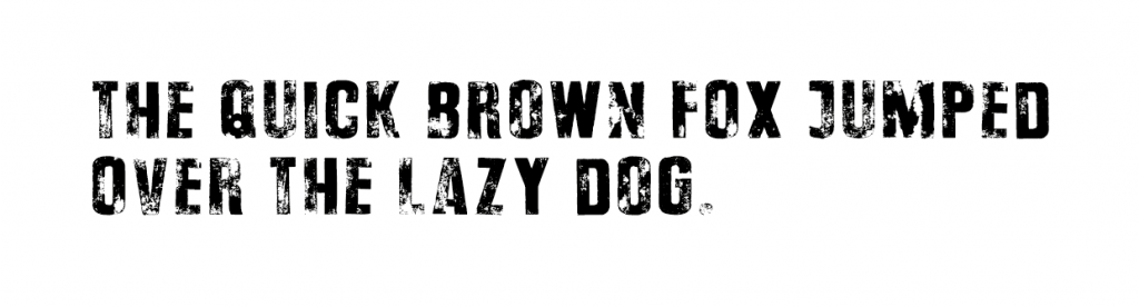
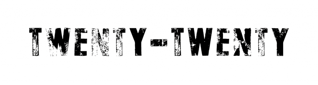
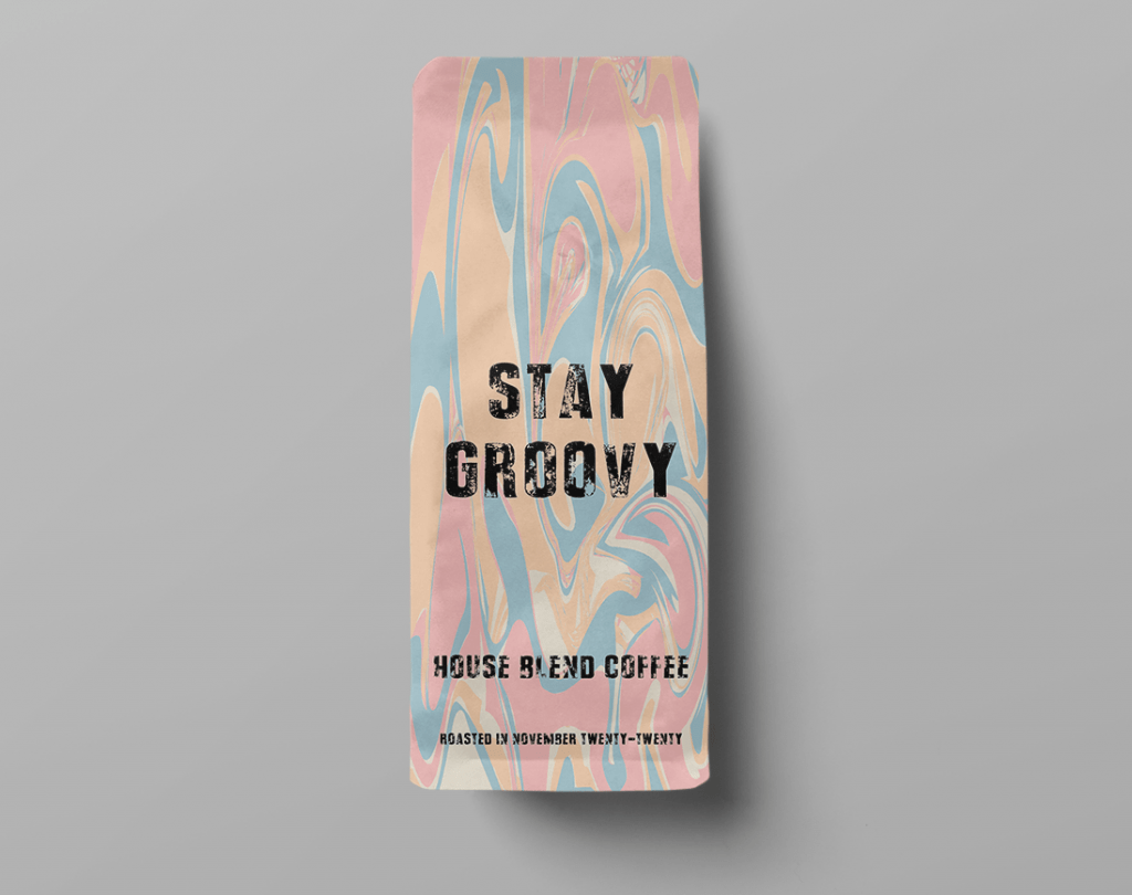
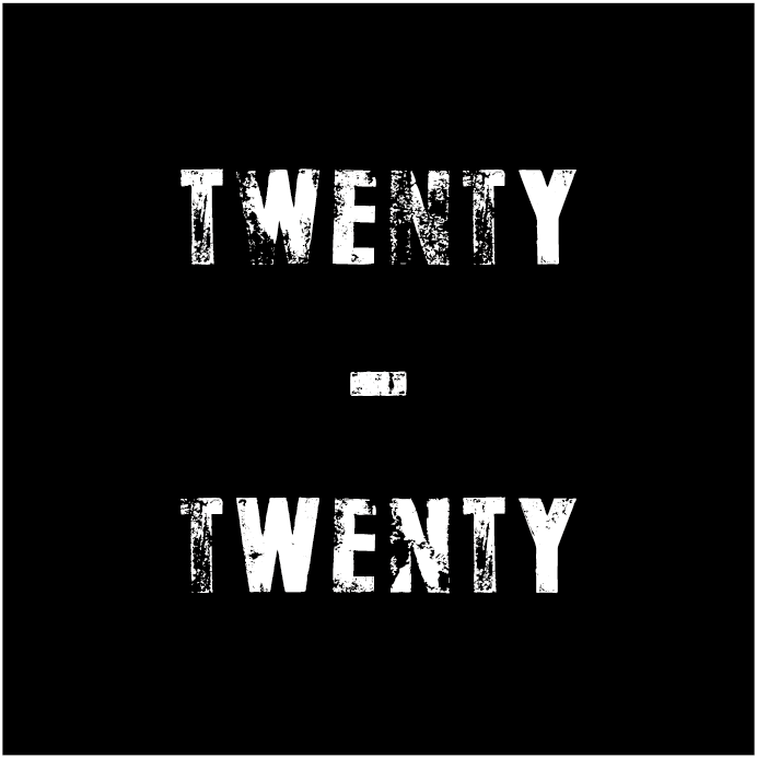
These subtle differences make the text flow well when used in a title or short sentence, as seen in some of the examples below.